Wildly Good Pairings
Wildly Good Pairings
Some colour combinations just seem to make sense, even when they aren’t combinations we would necessarily think to put together ourselves.
Read more
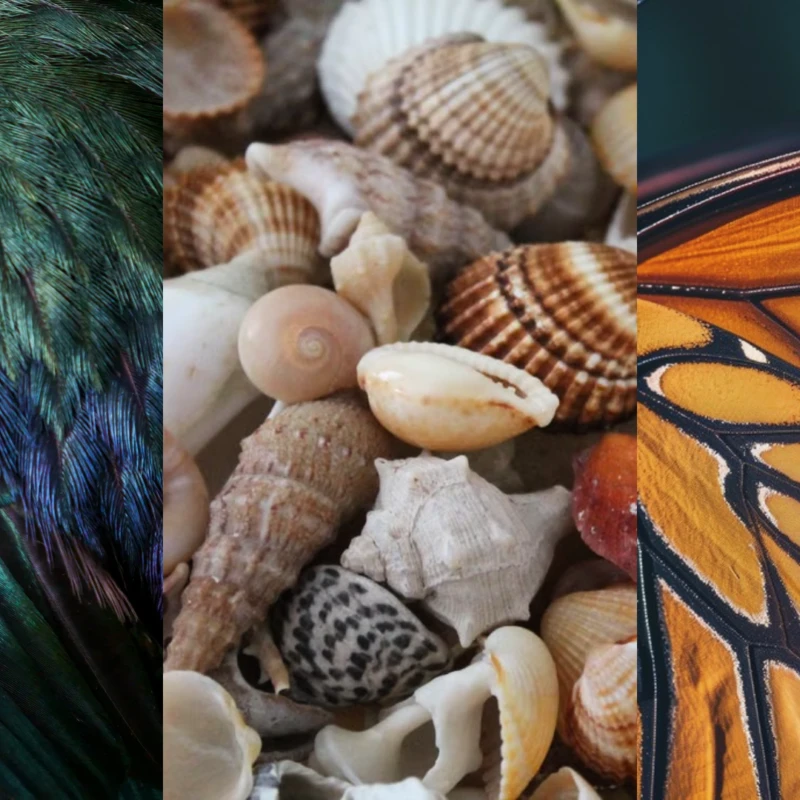
Nature has a pretty good way of putting colours together that feel unexpected but completely right, like flashes of burnt orange against black, soft beige tones layered together, or deep greens, blues and purples that look different every time the light catches them. So for these moodboards, we looked outside for inspiration and brought some of those combinations back indoors, pairing a few of our favourite Bradfords pieces with colours found in the natural world.
Orange and black is never going to be a quiet combination, but that is exactly why it works. Taking our cue from the markings of a butterfly wing, we have paired warm caramel and copper tones to sit against deep charcoal and black, with crisp white accents breaking things up and keeping the darker colours from feeling too heavy.
The trick at home is to let the warmer tones do some of the talking, then use darker furniture to ground the palette and lighter pieces to keep things feeling balanced. You don't need to introduce every colour at once, either. A caramel chair, a warm timber finish or even a few amber-toned accessories can be enough to bring a little warmth and personality to a darker scheme without turning the whole room orange.
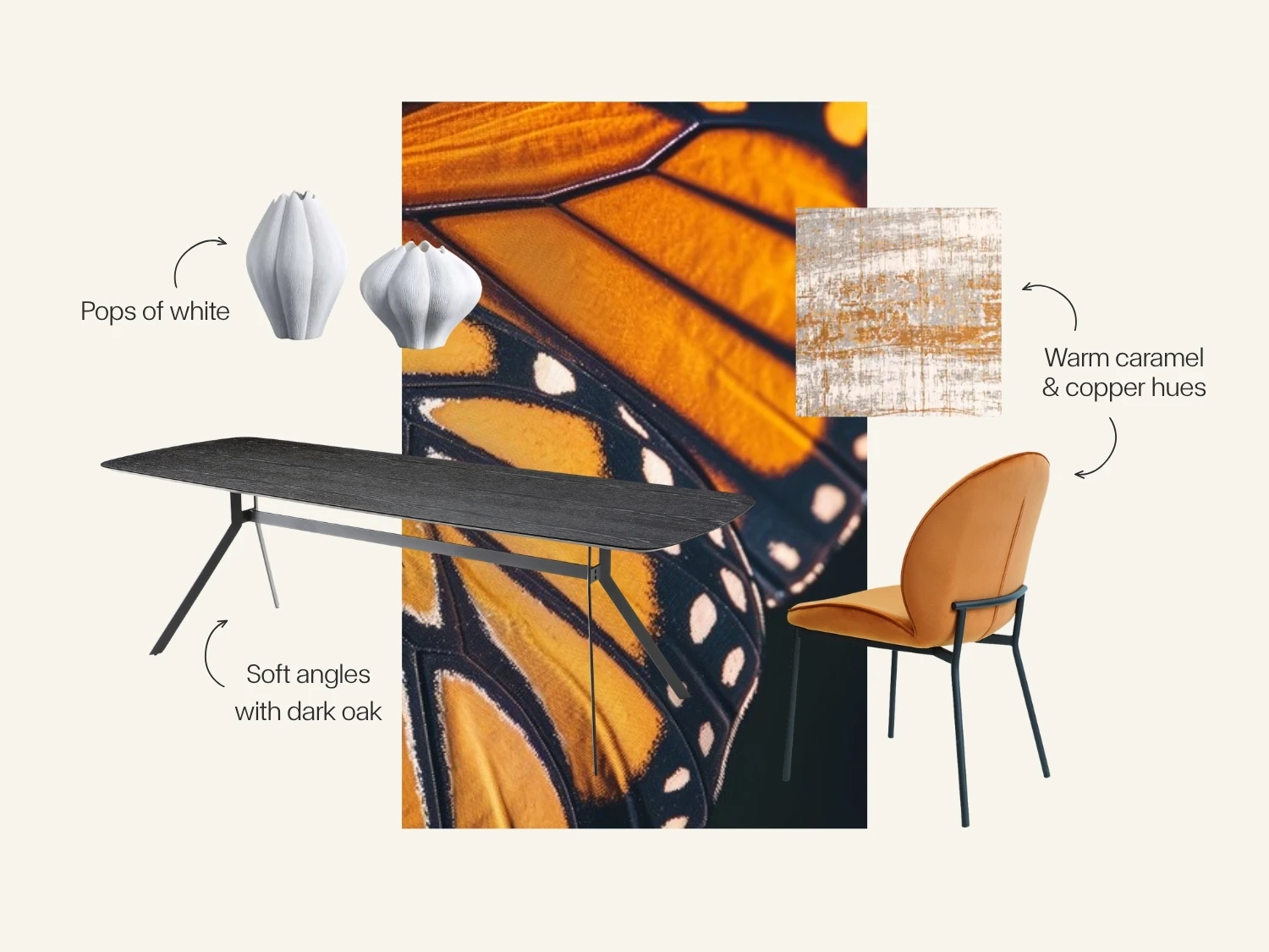
Featured Products: HUSK Dining Chair in Copper Velvet, BRACCIO Dining Table in Black Oak, CELESTE Vases, GRIFF Rug in Columbus Gold
Neutrals do not have to mean playing it safe. If you look at a handful of shells, you will find cream, sand, taupe, brown, soft grey and warmer blush tones all sitting together, creating a palette that feels completely natural without a single shade needing to match perfectly. That is where this palette gets its appeal.
Rather than picking one neutral and repeating it from one end of the room to the other, layer different shades, finishes, and textures to create something with more depth and personality. The colours can be similar without being identical, and the subtle differences keep the space from feeling flat. Upholstery, glass, metal and timber each bring their own texture and character to the mix, while the overall palette keeps everything feeling cohesive. It's neutral, but not predictable.
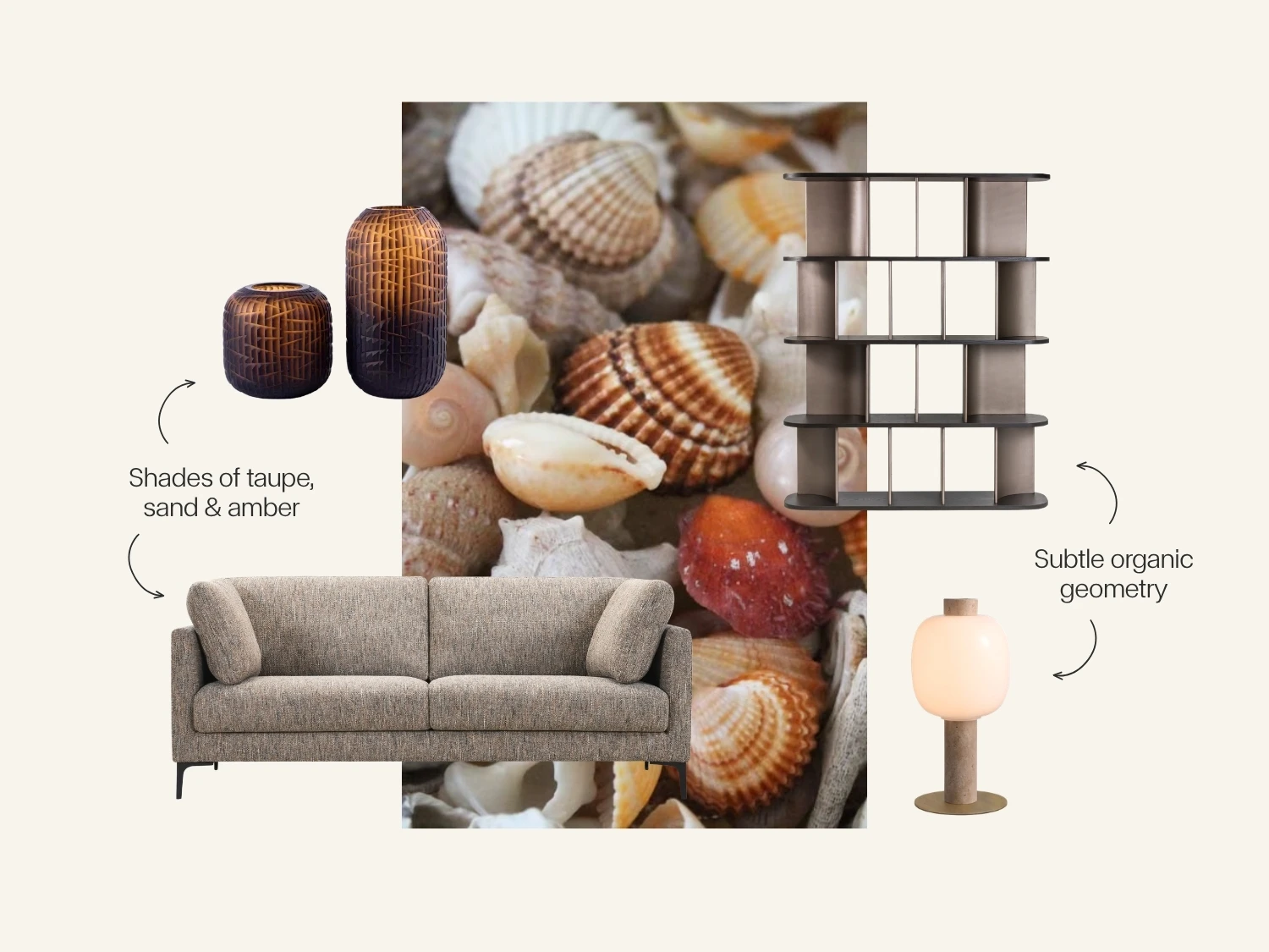
Featured Products: ARAN Sofa in Copper-Grey Fabric SANDI Bookcase in Dark Oak & Bronze, BRILL Lamp with Travertine Stem & Bronze Base, PERU Vases in Cacao Glass
This one is all about colour that shifts with the light, with the feather moving between olive, teal, navy, violet and bronze to create a palette that is more interesting than simply calling it green.
Bring that idea into the home by starting with an earthy base, then layering in cooler blues, smoky glass, deeper jewel tones and pale stone. Don't feel like everything has to match perfectly. In fact, the subtle differences in tone are what give the palette its depth, particularly when those colours are picked up across different materials, finishes and textures.
It's also a good example of why warm and cool colours do not have to be kept apart. When grounded with natural tones and balanced across furniture and accessories, they can sit together effortlessly and create a space that feels layered, considered and a little more unexpected.
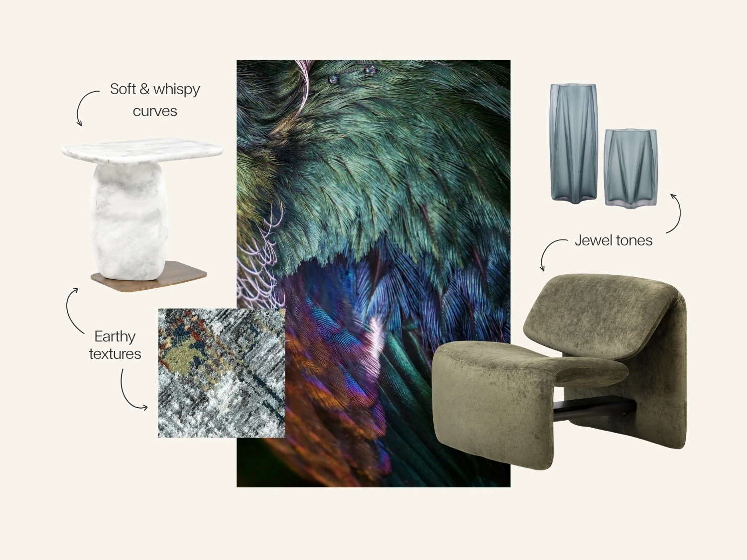
Featured Products: AGAVA Side Table in Arabescato Marble, AVANT-GARDEN Accent Chair in Moss Velvet by Bonaldo, CYPRUS Vase in Teal-Blue Glass, IVANA Rug
The best part about looking to nature for colour inspiration is that it takes some of the pressure off trying to get everything perfectly matched.
Nature does not really do matching sets. It layers similar tones, throws in contrast where you least expect it, mixes soft and hard textures and somehow manages to make all of those different elements feel like they belong together, which is probably why it tends to get colour right.
So next time you are standing in a room wondering what works with what, look outside before you start trying to find the perfect colour match. Bring your inspiration with you when you come into the store, whether it's a shell you picked up on holiday, a feather you found on a walk or even a piece of hide that has caught your eye, and use it as the starting point for finding the colours, textures and pieces that work around it.
Sometimes the best place to start is not with a colour chart, but with something you already love.
Some colour combinations just seem to make sense, even when they aren’t combinations we would necessarily think to put together ourselves.
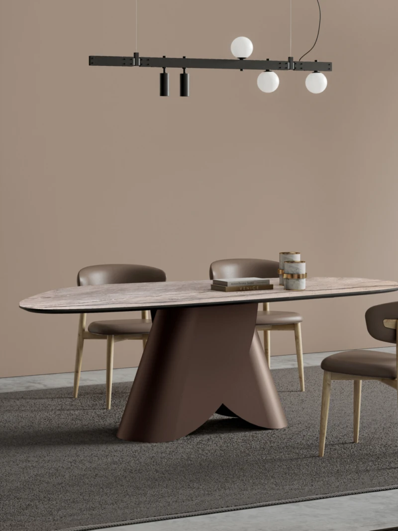
Italian design has a way of making even the most functional pieces feel considered.